For those that call Australia home, there are probably many things they can point to that make it a great country to live in. One of these is that the average life expectancy in Australia is among the longest in the world. This is one of the factors that has led to significant growth in older populations in our communities.
According to the Australian Bureau of Statistics (ABS), there are over one in seven Australians (3.8 million) aged 65 years and older in 2017. That makes up 15% of our total population. By 2057, it’s projected that there will be 8 million older people in Australia (22% of the population).
While we know Sydney is growing older, do we know where these older people live? It’s important to understand how this change in population age profile in our communities can affect cities like Sydney. Using the 2016 census data, Astrolabe has looked at the data to find ageing population clusters in Greater Sydney. What we found is that ageing is not evenly spread.
Here’s the technical rundown of how we did our analysis. We started with the 2016 Census data at two geographic scales used by the ABS, the Statistical Area 1 (a small area with about 400 people living there) and Local Government Area (LGA) which show Council boundaries. We then used a measure called the aged dependency ratio. This compares the number of people aged 65+ years to the population aged 15-65 years in every area.
The red and orange areas of the maps created show the highest concentrations of older people, where the blue areas have younger populations. We know this measure has limitations because age does not tell us how dependent someone is, but we’ve used it here to start the conversation and so we can compare our analysis to other work being done to plan for our ageing population.
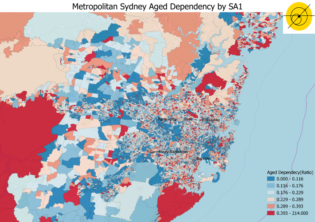
The first two maps show the results mapped to LGA and SA1 levels.
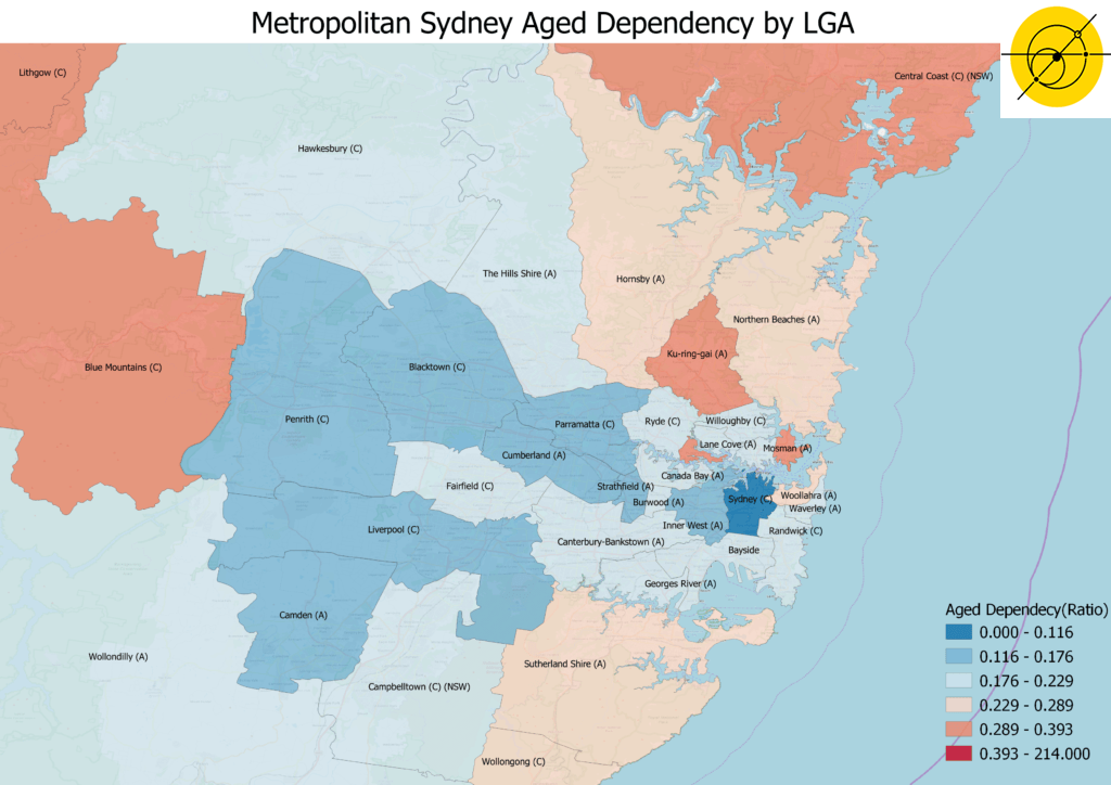
Across metropolitan Sydney, Hunters Hill and Mosman LGAs have the most significant ageing with Aged Dependency Ratios of 0.36 and 0.30 respectively. This means for every person 65 years or older there are three people of working aged (15-64 years).
The second map shows that LGA level measures can mask significant aged population clusters when you drill down to local communities. LGAs like Bayside, covering south east suburbs around the airport and parts of St George, and Canterbury-Bankstown, spreading from the inner west of Sydney to the Liverpool and Fairfield along Cooks River, have relatively low aged dependency ratios.
When we drill down further, the SA1 map shows that suburbs tell a different story, such as Sans Souci and Monterey in Bayside, or Earlwood and Kingsgrove in Canterbury-Bankstown have one person 65 and older for every two of working age (15-64 years). Aged population clusters are also seen in the north of Sydney, where Castlecrag in Willoughby stands out, Macquarie Park in Ryde, and the north part of Parramatta. These suburbs tell a different story when looked at compared to when included in their local government area.

We also took this data and applied a hotspot analysis based on the aged dependency ratio of an area as well as those areas adjacent to it. The results are shown in the following map, where hotspots and coldspots are highlighted in red and blue respectively. Hotspots are where significant ageing clusters are located, and the coldspots give the opposite view. This map gives a sense of where the priority clusters of ageing population are, clearly showing the areas that need to be a focus of attention.
This data highlights the need to understand what is happening at a small area scale to know where older people are living. Some of the questions we could be asking with this data include
- Are health and social support systems in place where these people are living?
- Are these hotspots near where staff providing services are living?
- Can service providers afford the housing in these areas?
- Are transport links and walkways designed for older people?
- What is about these hotspots that are facilitating people to aged in place?
Mapping information about the older population can help make service delivery more efficient and ultimately service our older population more effectively.
In Japan, where the population is significantly older than in Australia, age-friendly cities are being created based on the principle of a compact city, with high-density living, promotion of walkability, and a focus on public transport. For a sprawled city such as Sydney, we can take the lessons from places like Japan, and ensure delivery of services and infrastructure near those who need it.
So, how should we be planning for ageing populations?
Noah Fu is a City Analytics student at UNSW completing his thesis on a Safety Index of Active Travel Infrastructure. Michael Comninos has been his mentor through the Career Ready Mentoring program, which has also seen him participate in work experience at Astrolabe Group to gain a deeper understanding of how we work to create a positive impact for people and places.
Dr Kim Johnstone is an Associate Director at Astrolabe Group. As a demographer, she is passionate about understanding people to make better decisions in city shaping.
If you want to find out more about population issues and its impact on policy, email us on [email protected].